


The short answer: your website needs a redesign when the problems are structural — confusing navigation, poor mobile experience, a visual identity that no longer matches your business, or a pattern of users dropping off at the same points — rather than a handful of isolated issues that targeted fixes could resolve. Not every website problem requires a full redesign, and treating a fixable issue as a redesign project wastes budget that could go toward better returns elsewhere.
How do I know if my website needs a redesign?
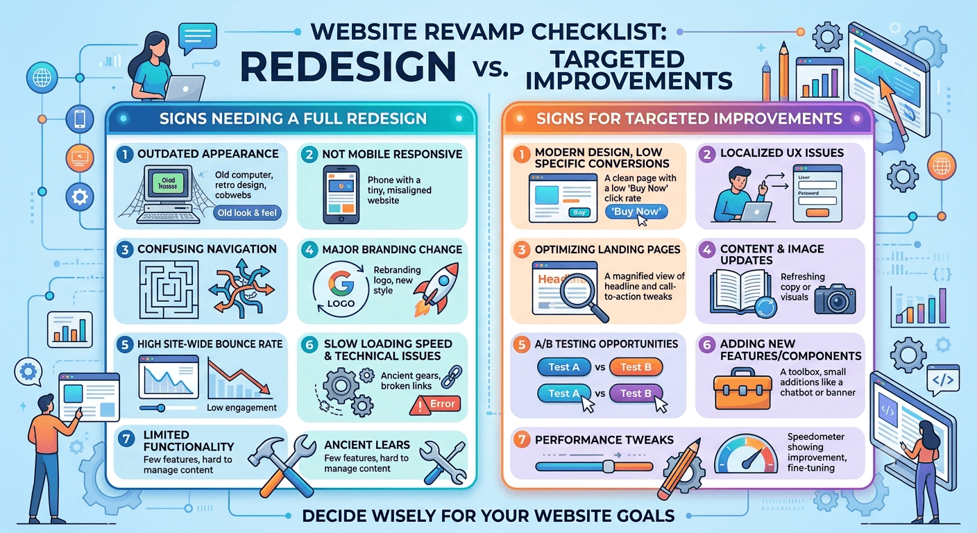
Signals that point to a real redesign need
Consistent drop-off at the same step, visible in analytics — users reaching a specific page or step and leaving at a much higher rate than elsewhere, suggesting a structural usability problem rather than a content issue. Mobile experience that feels bolted on rather than genuinely designed for how people actually use phones — a strong signal if a majority of your traffic is mobile and the desktop experience clearly came first. Visual identity that no longer reflects your business — this matters more than it sounds, because a dated or mismatched design actively undermines trust before a visitor reads a single word of your content. Difficulty adding new content or features because the underlying structure wasn't built to accommodate growth — a technical debt problem that shows up as a design problem.
Signals that suggest targeted fixes instead
If the core structure and navigation work but specific pages underperform, that's often a content or conversion-copy problem, not a design problem — the fix is rewriting and restructuring that page, not rebuilding the site. If load speed is the primary complaint, that's frequently a technical performance issue independent of the visual design entirely. And if the issue is isolated to one feature or flow rather than the overall experience, fixing that flow specifically is faster and cheaper than a full redesign that touches everything, including the parts that already work.
Why "it looks dated" isn't always the real signal
A site can look visually current and still have serious usability problems, and a site with a slightly dated aesthetic can still convert well if the underlying structure and flow are sound. Chasing visual trends without evidence of an actual usability or business problem is a common way to spend redesign budget without moving any real metric — the research-first approach covered in why UX research reduces development cost applies directly here: validate the actual problem before committing to the expensive fix.
The diagnostic step most teams skip
Before deciding on a redesign, look at your actual analytics and, ideally, watch a few real users attempt key tasks on the current site. This single step routinely reveals whether the problem is structural (genuinely needs a redesign) or specific (needs a targeted fix) — and it costs a fraction of committing to a full redesign based on instinct alone.
The practical takeaway
A redesign is the right call when the problems are structural and validated by real user behavior, not when the site simply feels stale to the people who look at it every day. If you're not sure which situation you're in, that diagnosis — not a redesign proposal — is the right first conversation. Our UI/UX design team starts every engagement by validating what's actually broken before recommending the scope of the fix.
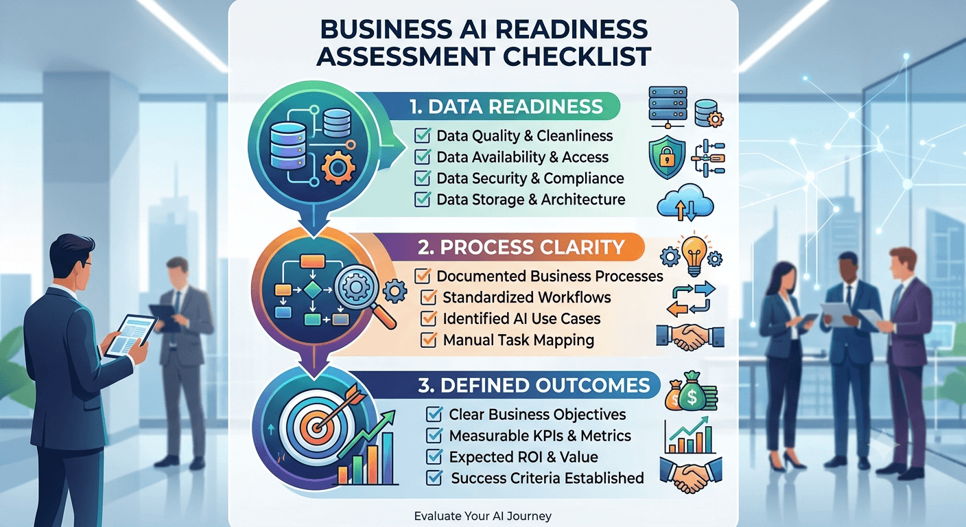
How do I know if my business is ready for AI?
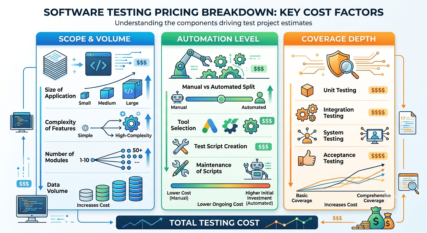
How much does software testing cost?
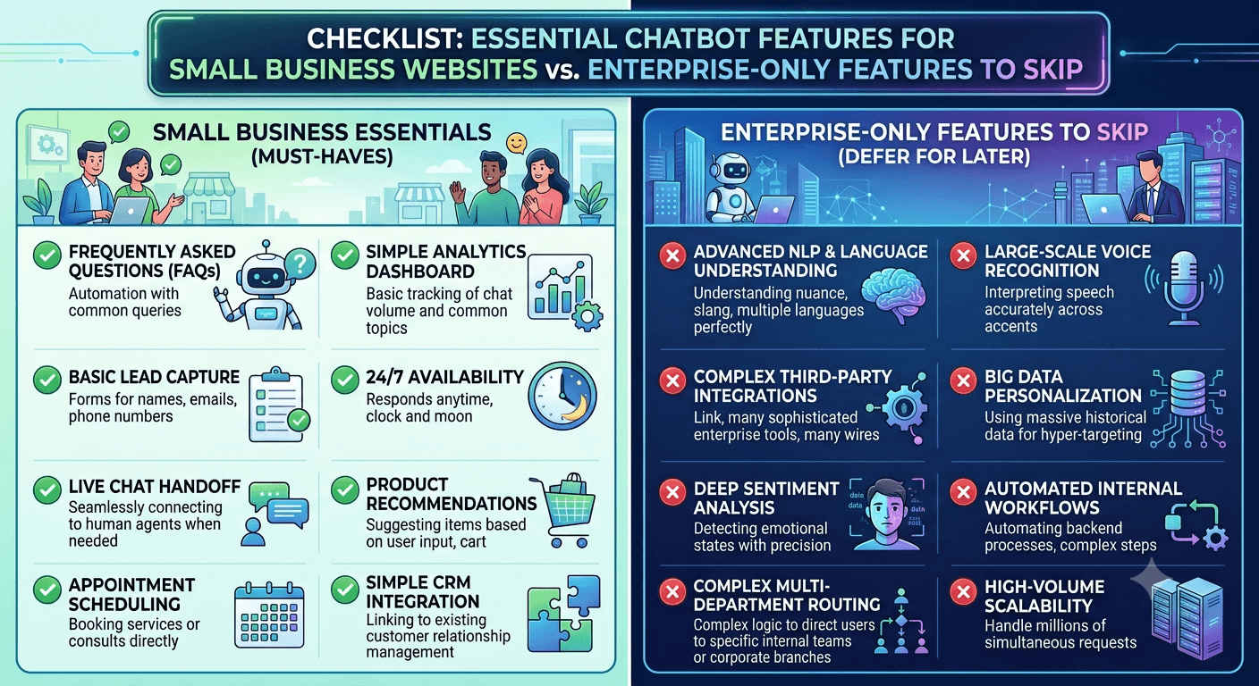
What features should a small business actually look for in a website chatbot?
How does a website chatbot help small businesses get more leads?
